by Gene Crawford | Jun 4, 2015 | Conference, Gallery, Nonprofit
There is a lot going on here to get this website responsive visually. The grid is pretty core to its layout and it flows really well from screen to screen width. I also really dig how the header/nav stays fixed and moves up visually as you scroll down. From the...
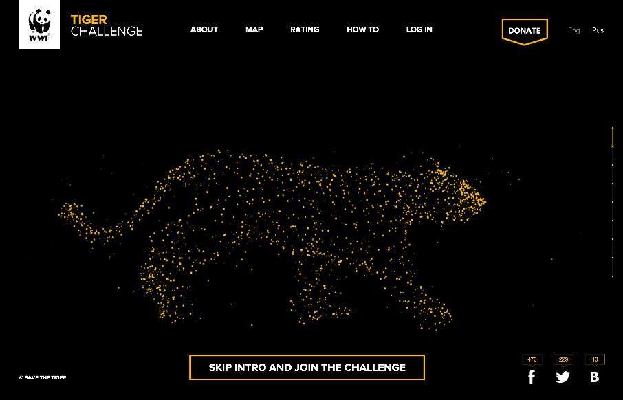
by Gene Crawford | Jun 3, 2015 | Gallery, Nonprofit
Solid, solid design here. There’s a lot to this design but I only want to look at one thing for this write up. Take a look at the screen layout changes between what looks like iPhone and iPad – the marquis areas break out of being on top of the hero image...
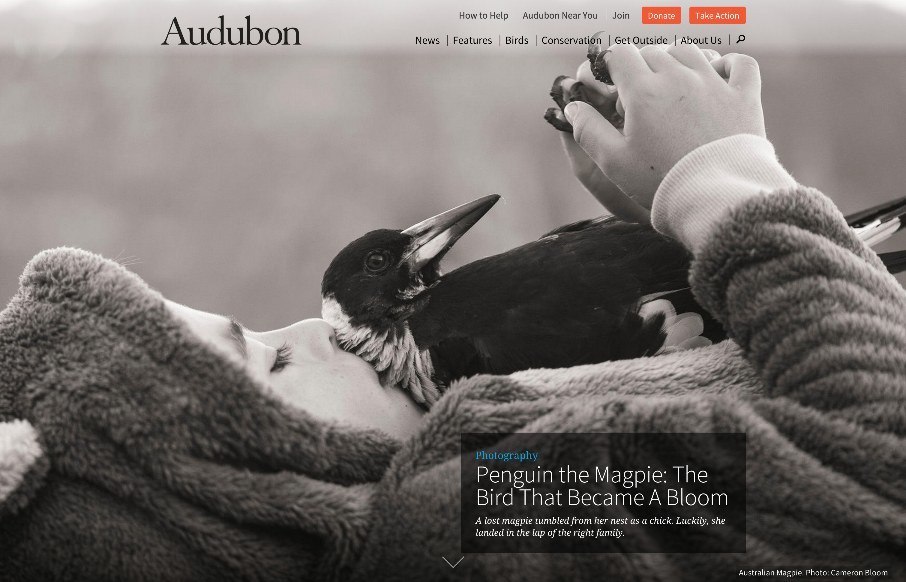
by Gene Crawford | Jun 2, 2015 | Gallery, Nonprofit
A beautifully executed website for Audubon. I love how the first thing you see is kind of like a splash screen, with a large image but still visible navigation, then as you scroll it slides up to reveal a more traditional feeling site. Then the site is not very...
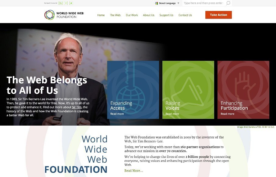
by Aaron Griswold | May 4, 2015 | Gallery, Nonprofit, Social Cause
We here at Unmatchedstyle apologize for falling off the map last week a little – we were running one of our web designer conferences, getting ready to teach our Iron Yard class, and one of us had a baby… either way – we thought we’d start the...
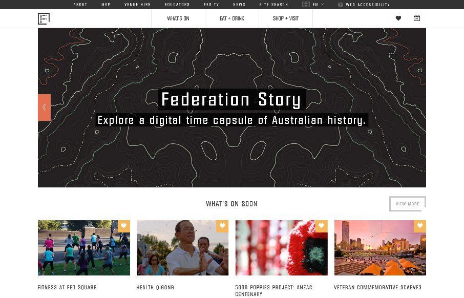
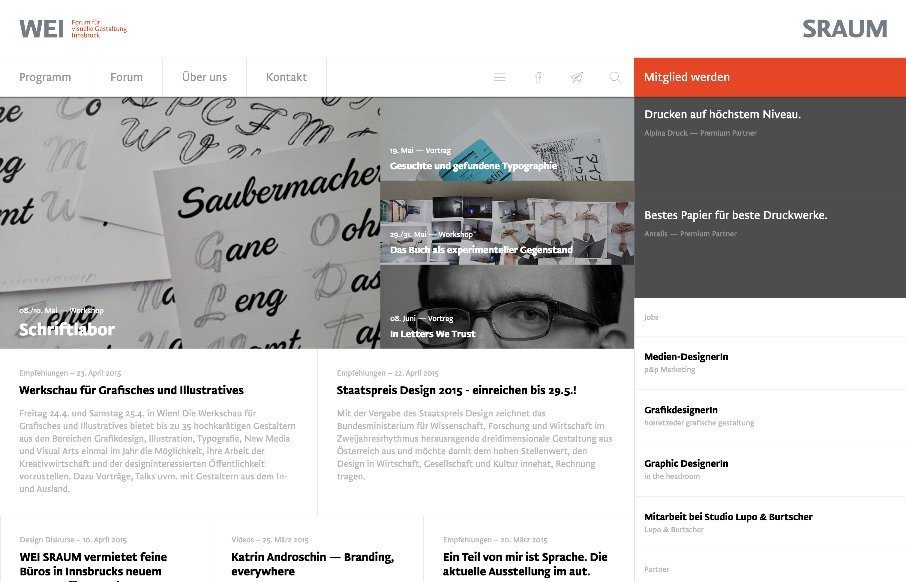
by Gene Crawford | Apr 25, 2015 | Gallery, Nonprofit
I like the blocky-ness to this layout. Though at first it comes off as little cluttery looking, I find myself liking the way the navigation is done. The small black line with standard nav items and then the larger more central nav items under that to stand out more is...
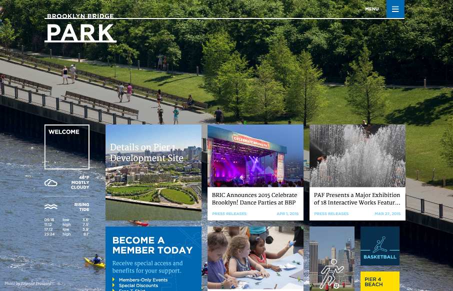
by Aaron Griswold | Apr 9, 2015 | Gallery, Nonprofit
The new Brooklyn Bridge Park site, done by Kettle NYC, is kind of a monumental achievement, like the bridge and park themselves. There is a lot going on here, from the infinite scroll card design on the home page, to the three – four different forms of...