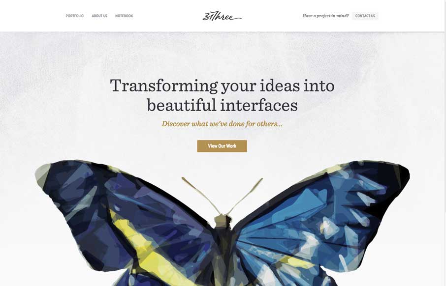
31Three
![]()
I found this site a few weeks back via the Current Style in Web Design article over at Web Design from Scratch and loved it immediately. In fact, it went into my design screenshots the day before I found out about UMS being for sale.
The number one thing I like about it is that it perfectly achieves its goal of convincing you that they know what they’re doing. If I’m looking for a designer, their site darn well better be super well designed. This one is.
The colors are great, the text is easy to read (though a little small for my taste) and the images are fantastic. The code is also very tight, creating a very small, lean page. The images do add a lot of weight to the page, but they’re worth it, and even when you turn them off the site is perfectly useful.
Design is worth very little if your site is nothing more than a pretty face, though, but that’s not a problem here. You find very few sites where the information is as well-architected as this one. The communication on every page and on the site as a whole is crystal clear. You don’t have to make any effort to find the information you’re looking for or to figure out what 31Three does. Your eye and your mouse naturally flow with the design.
My biggest knock against the site is that much of the larger text is in images and doesn’t use any sort of image replacement or even a meaningful ALT attribute. On the homepage, for example, that leaves us with “label_portfolio” when images are off instead of “The Proof is in the Portfolio.” That could be easily remedied.
All-in-all, though, this is a site that is as much “brains” as it is “beauty” — a site that uses design to achieve a higher goal, rather than as an end unto itself. A true model of effective design.
Feeds


Yup, this is indeed a gorgeous design. I’d agree with pretty much everything you said there.
Now this is a great design! excellent code, site looks great on 1440×900, totally balanced.
Graphics and layout look great! I love the butterfly coming out of the laptop…very beautiful.
Indeed - one of my favorite sites.
Can’t say anything bad about this site. I love it. From colour scheme to code. This site has it going on. I believe the dog pound would agree. We got a hot one! (j/k) No but on a more serious note, this site has every thing well structured, eye catching headers, good use of arrows to call a user to a particular link, the nice big laptop. The only thiong I would have preferrd personally is maybe a bigger font-sized on the text. I don’t know why but I love huge fonts. Maybe cause I wear glasses