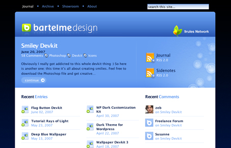
Bartelme Design

Following numerous realigns, Wolfgang Bartelme comes back from a stint of inactivity to wow us with one more realignment. Bartelme Design is the design studio headed by Wolfgang Bartelme, housing both a blog and portfolio. I can’t say for certain how many versions of Bartelme’s site I have seen, but I’ll be lying if I could say I can count them on my hand.
Realignments aside, Bartelme’s new site seems to take heavy influence from his previous versions, but unlike the last version, he has forgone the fluid layout. I much rather enjoy this fixed-width layout. It’s better organized and has much more of a calming effect compared to his previous versions. The layout is fantastically well polished and the colors, having undergone several iterations, are better than ever.
Bartelme’s design skills are most well-known for his icons, but his Web design skills parallel his inept ability to capture an application’s purpose in one of the most confined areas, that being in an icon. My favorite parts are the colors and the showroom, revamped along with the homepage, archives, and article pages. It’s clean cut, randomly shows some killer projects, and for some reason, it just feels right. In all likelihood I can blame the two- to three- to four-column layout variations. It just flows.
The unmatched ability to master colors and designs of all trades makes Bartelme Design a worthy entry in my book.
Feeds


Hey there - thanks for the kind words :)
Not at all, Wolfgang.
Keep pumping out great icons and websites!