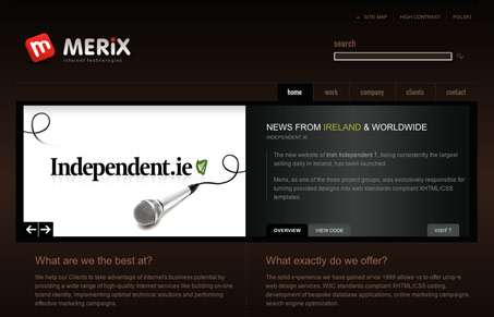
Gallery
May 25, 2006
Rating
Rated 8.8 from 173 votes
Tags
Share
Merix
![]()
As someone commented in the original thumbs up/thumbs down vote, Merix has been a popular site on design showcases recently — and rightfully so. Not only does it look great, the code is fantastic — both the CSS and the strict XHTML — and the site is coded to be highly accessible. Very well done.
So welcome to the Gallery our first site from [tag]Poland[/tag]!
Take a look at Merix and add your own perspective below.
Add Your OpinionMore Opinions on Merix
Pings on Merix
-
[...] jestesmy całkiem dumni, że byliśmy pierwszą polską stroną na Unmatched Style, (później dostaliśmy się do niej ponownie, a z tego co widzę jesteśmy jedyni pod tagiem [...]

I’ll make sure to come back past in a couple of days and add to this review - but thought I’d try and get in early on this one, rather than posting at the tail end of all comments :o)
Yes, I like this one. Not sure about all the 10’s that it’s obviously been awarded so far (I wonder who they might be by ;o) ), but it is nice.
They use a very strange method of using Flash for their logo and image of headphones which I can’t say I’ve seen before. This has got me wondering about what possible benefits or disadvantages this might present? I did wonder why the logo looked a little rough at default 100%, but then became extremely crisp on re-sizing the text larger. …interesting.
My only part of the site so far that I dislike is the white main navigation bar. Everything below this looks fantastic, but this then makes the nav look very segregated and mis-fitting with the rest of the design. Whether this was purposely done for some reason we shall have to wait and find out.
Anyway - like I said, I’ll make sure to pop back later when I’ve had more time to look at this in-depth, but just thought I’d come on to say “Good Work” (so far…)
Chris
You know, it’s a great site and I love the design, but what’s with the geek-speak on their bullet points? What are web standards? What are “white hat SEO techniques”? Yeah, I know, small gripe, but I like the rest of the site so much I would like to see it perfect :P
Overall, great design and _very_ creative!
CODE IS FANTASTIC?! Yep, two divisions containing absolutely nothing is definitely just awesome.
And it’s not just once. Everything is wrapped several times, making the code, well, horrid.
Yes, the design is good, but the code just isn’t. At all.
the website looks cool, well colored , but not really a good coding.
if it was up to me i would have decreased the padding off the top of the page, and the page would fit perfectly, no need to scrole down anymore.
One thing i really liked, was the animated Fav. Icon. really cool.
Also if they had kind of a limit or a line around their middle section , gettinf focus of eyes, would be so much better. my eyes dont know where to start, where to stop.
i say again i really like the colors
Yeah it is a nice design, I’m not sure about the white at the top though.
But what about that code? Something went really wrong there..
Hello all, and thanks for your opinions on our website. I would like to clarify three things
When we started to create this site we’ve agreed to make it as accessible as it could be. We also wanted to use the layout you can see now on the page, without removing any of the small details. All that extra wrappers are there to ensure that text resizes correctly and all the design elements are in place. There is of course some place for improvement, and we will try to reduce the number of unnecessary objects.
The other thing is the copy. This website is usually the only thing our clients see before contacting us. Most of them have no idea, or simply don’t care about web standards, use only one web browser and are totally confused when it comes to accessibility or usability. We wanted to make sure, that they are aware of what we try to accomplish while designing the site.
As for the flash - the reason for using it was caused by smaller size of the image when compared to PNG; another aspect taken into account was what the logo, and headphones will look like when the pages are zoomed in.
Thanks again and we would like to hear more from you, especially on possible improvements.
Ha ha, the codemasters have spoken. Don’t worry about them Merix.
For all you “experts”: unfortunatelly, to achieve resizable effects like this without js it’s necessary to put in some extra xhtml tags. And it’s ok. Just don’t know what are t2 and t2a div’s for, but maybe it’s your cms or something… nevermind.
Personally, I think they have done an outstanding job. Rated 10. Congrats!
Hi,
Not wanting to insinuate any sort of underhand tactics or anything - but I do find it a little odd that this design has received 4 times as many votes as any of the other designs lately.
How come so many poeple decide to vote on certain designs but not on others?
unmatchedstyle.com is getting more and more popular - that’s why! Site rated 10! Awsome!
These two empty divisions are placeholders for two planned, yet not implemented features, namely live-chat and site search. Both are included in the original project and in the XHTML structure, we had to make a decision, whether implement them the right way from the start, or don’t implement them at all…
Our site has been dugg here: http://www.wykop.pl (it is a Polish counterpart of http://www.digg.com ) so I guess this might be the cause of all the votes we’ve got.
http://www.wykop.pl/link/3258/pierwsza-polska-strona-na-unmatchedstylecom.html
The title in English is “First polish site in Unmatched Style gallery”