Momentum

Momentum

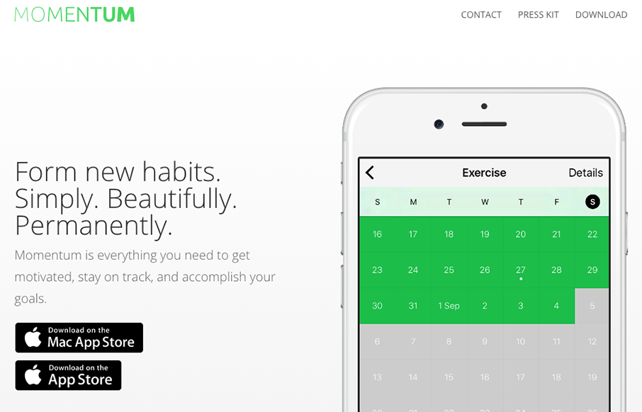
Really beautiful and simple site for a really beautiful and simple idea. I dig this idea and I dig the design approach to the website. Show's you how the app looks and works in context in a website layout that's easy to scroll and take in. Good work.

fable & Co

fable & Co

The first thing I see when I check this site out is the use of typography within the imagery. Very cool. I also love the use of color being minimal and only on instances where work is being shown off. Good stuff, subtle design. Bravo.

eDesign

eDesign

Really strong visuals and movement. Just enough and just tight enough to make you take a second gander. I dig the menu design/interaction too. Solid work through and through.

Cosme Faé

Cosme Faé

I like the dark background used here, the typography in the top portion of the page is solid too. Haven't seen that in a bit, that mixed withe the asymmetrical intro of all the images makes for a cool vibe. Thorough case study pages give you plenty of great content to...

Fixx Digital

Fixx Digital

I really like the use of the product imagery and the typography. Super cool look and feel. There's a good bit going on visually here, including the changes to the design as you scale down the window to fit smaller screens. Solid work here. From the Designer: Fixx...

C RCL

C RCL

Cool interaction as you scroll the page. The way it moves from top to bottom is fresh. I also like the offset copy placement. Good looking design here.

Heidi Pun

Heidi Pun

Pretty cool custom personal site. I dig the black and white and the three column basic approach. Very cool and simple.

harbr

harbr

I love, love, love this layout. I love the way the images load and the way they are spaced, etc... brilliant site design harbr!

dunlop builders

dunlop builders

Beautiful photos for dunlop builders. I really like that hamburger nav and placement, especially with the blue circle that helps draw your eye to it. Then when you click it it enlarges, pretty cool.

Right Colours

Right Colours

Clever hero image and I love the bright colors. Very strong and simple visuals help guide you to understand what these guys do, bravo. It's harder to do than you'd think, right?

Charles Milnes

Charles Milnes

Pretty stellar "page load/scroll" animation work. I dig the color palette for this site too. Really clever looking work.

WhiteHall

WhiteHall

I like the 1/2 way corporate and 1/2 way trendy feel to the site for WhiteHall. Great typography and some good photography make the site shine to me.

Field Notes

Field Notes

It's been a long time coming! New design for Field Notes. Man, I love me some field notes for sure! I really dig the site navigation/architecture. Jamming all that extra stuff under "more" is pretty clever. I also really love the way the "quick view" on the product...

Collected Coffee

Collected Coffee

I love the delicate approach to this design. From the typography to the way the illustrations are done and objects are placed on the page. Beautiful comes to mind.

Good Bytes Box

Good Bytes Box

Nice layout for Good Bytes Box. I dig the long scroll-y page with the centered icons. Good stuff.

Midwest Property Management

Midwest Property Management

I dig this site for Midwest Property Management. The patterns feel real familiar, like boostrap-py but it's visually designed to give a real deluxe vibe. The lines and crisp photography work so well to sell the vibe. From the Designer: A mobile-first responsive build,...

Authentic Form & Function

Authentic Form & Function

Beautiful site design for Authentic Form & Function, I mean, sincerely. I love the layout, the asymmetrical approach is nice here and the muted color palette really sells the exclusive vibe i'm sure they're going for. That main nav that's triggered by the hamburger...

FallingBrick

FallingBrick

Pretty different vibe for the layout on the FallingBrick website. I find the placement of the "hamburger" nav item real interesting. I'd be super curious to see what kind of influence placing that in the center of the "header" area would have on it's discoverability....

Website Style

Website Style

Some really nifty and intense looking visual interactions for the Website Style site. I dig the muted (black and white) visual look as well as the long scrolling page with tons of detail work. Solid looking work. The experience gained during our previous realizations...

Studio 19

Studio 19

This Studio 19 website is in the gallery because of the screen to screen transitions. Pretty sweet stuff there. I'm not sure it'll work for a lot of generalized design usage but here it's a cool tough.

Zoltar Speaks

Zoltar Speaks

Cool site from @weareimpero. I'm a little late posting it, they technically submitted it before the Brexit. Still pretty neat though. From the Designer: Zoltar and the entire site is hand illustrated. The site is heavily based on SVG, both Zoltar and UI elements are...

Signac

Signac

I love that background animation, very cool. I also dig the idea that this sited design is so non-traditional for what you'd think this company does. Love it. From the Designer: We had fun bringing a lot of animation to what would otherwise be a very simple and...

Michael But

Michael But

Beautiful portfolio site that does just what it needs to do and not much more. Visually it's very classy and professional looking. I also dig that he mainly sends you to Dribbble and Behance to see more work and connect professionally. From the Designer: A minimalist...

Lingo

Lingo

Really great product website design. I love the illustration work, it gives the product so much character. That said, what I love most is the way this site interacts, much of the content is displayed in non-traditional (just another page) ways. Give it a once over and...

Red Ledges

Red Ledges

Spot on site design for Red Ledges. Simply beautiful. The team at eHouse Studio never lets us down with great work. Enjoy! From the Designer: Site’s audience + purpose: Red Ledges is Utah’s premier four-season mountain community in the beautiful Heber Valley. It is...

Ollestudio

Ollestudio

Pretty unique take on an agency website look. It feels very experimental in it's approach to relaying content. I love that the most about it. Good effort there to keep it fresh and approachable at the same time. It's also a nice visual design too. From the Designer:...

Pantaloon Press

Pantaloon Press

Unique in that it's really just a single page layout for this business. You don't see that too often. It's beautifully simple too, which is always going to win in my book. Pantaloon Press publishes email newsletters distinguished by original writing, elegant design,...

Howdy This

Howdy This

Man, I just love the site for Howdy This, so clever. I love the layout and the limited color palette. The typography is solid from top to bottom. Beautifully done and quite unique looking to me. From the Designer: We tried to enhance every section with some small...

Studio.Zeldman

Studio.Zeldman

Pretty cool. Zeldman is hitting the agency world again it looks like. So what do you do when you're Zeldman and you need to inform people of the things you've done. Just put it up there for everyone to remind them. Quite the resume man. Love this. Now, get to work...

Matt Welch

Matt Welch

I love this portfolio site for Matt Welch. "Most complex problems come with an NDA", amen brother. I love that he just puts that up front for you to know. It's the truth, if you do any sort of high-level work your public portfolio is going to be limited. He puts in...