by Thomas | Mar 31, 2026 | Blog, Gallery
by Thomas | Oct 10, 2025 | Blog, Gallery
by Thomas | Aug 15, 2025 | Blog, Gallery
by Gene Crawford | Mar 31, 2025 | Blog, Gallery
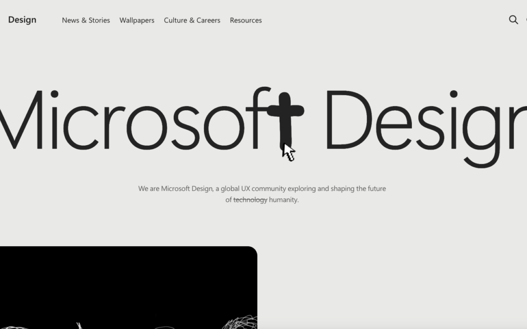
A great design where the only things we get visually are the things we need to consume the content. I never thought i’d get a real minimal approach like this form an org like Microsft. Bravo and great work.
by Gene Crawford | Mar 6, 2025 | Blog, Gallery, Portfolio
I love this minimal design so much. It’s minimal but there’s quite a lot of detail here for you to study.
by Gene Crawford | Sep 27, 2023 | Blog, Design Firm
I love the color palette of their brand and the simplicity in the design approach. The screen transition from one page to the other is a nice detail. Solid, simply layout and bold typography. It feels old-school without being old-school. I dig it.