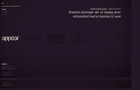
Really interesting, non-standard style of navigation for this website. It reminds me a lot of the way most “agency” style flash based websites present themselves. This one is just done using javascript. I like it, I think it has impact since it’s kept very simple. The user is presented with a limited amount of choices, work samples, to look at and a contact link. That’s good in my opinion, any more and it would skirt the line on being too much to figure out. I like the typography and notice they use cufon to pull it off, that’s a nice touch for this design too because I really think that chosen typeface in conjunction with the color is working well visually for this company.
Brutalism: The Beauty of Breaking the Rules
Brutalism in web design rejects perfection for authenticity. Stark grids, raw type, and honest structure create interfaces that feel human, intentional, and impossible to ignore. Break the rules, on purpose.


0 Comments