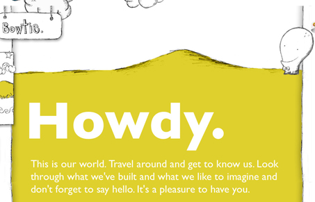
Interesting design here. I love the animated little dude that strolls around, the hand drawn nature of the illustration is really nice. The navigation is really weird but it’s working for them on their site. Overall this is a pretty fun website to look at, I don’t think a website like this is going to go very far for many other firms but in this case after looking through the work that this studio has produced it seems like a very fitting design.
Brutalism: The Beauty of Breaking the Rules
Brutalism in web design rejects perfection for authenticity. Stark grids, raw type, and honest structure create interfaces that feel human, intentional, and impossible to ignore. Break the rules, on purpose.


Love the playful illustration and flat, bright colors.
Looks like the hover is dropping out at first – but the design still pretty neat with no words, just the pictures.
That navigation really defies all logic, it just shouldn’t work usability wise…