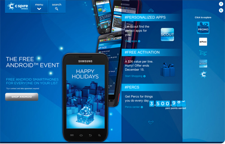
My first impression was that this is a different and almost strange layout. I thought “Where am I going to look first?” But very quickly I found myself engaging with the site in a way that somehow felt natural. The compartmentalization (dang that’s a long word) works and kind of mimics a mobile app environment which is neat. The color scheme is mostly monochrome but has a nice layered depth. The vertical parallax adds a nice touch too. The product results page seems disjointed from the rest of the site but overall there are some nice details considered here.


Glassmorphism: The Transparent Design Trend That Refuses to Fade
Glassmorphism brings transparency, depth, and light back into modern UI. Learn how this “frosted glass” design trend enhances hierarchy, focus, and atmosphere, plus how to implement it in CSS responsibly.


0 Comments