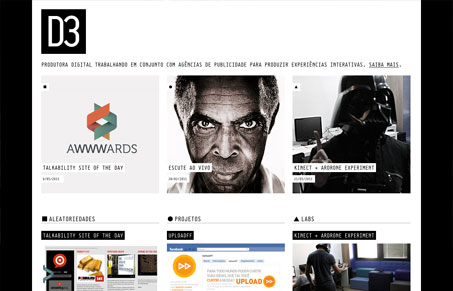
Smart design making the home page pretty much nothing but a portfolio like view of the posts. I dig it, what I don’t dig is the expand for more button/arrow below each column, it’s a bit weird to utilize in practice. I do love that crazy background pattern and the interactions over the main 3 images at the top of the site are just cool.


0 Comments