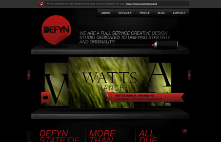
The thing that makes me look deeper at this site design is the gradient on the section headers along with the scrolling movement. I assume it intentional but it all moves, when elements are clicked, at a fast speed, the page scroll the slideshow speed all are set the same. That gives it a nice complete feel to me. Often I see slideshows and other interactive elements on sites and they all move at different speeds and stuff. There isn’t a lot here on this site but check it out and maybe you’ll see what i’m talking about.


0 Comments