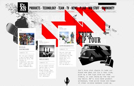
Cool non-standard looking website design. I love the multi grid layout and also the asymmetrical look comes off great with the heavy images vs. the thinner columns of images/text. The red really just explodes out of the background and gives is some really great graphical impact. I do think some of the fonts used, especially in the body copy areas become difficult to read because the lines on the characters are very thin. Overall though the multi column layout and strong graphical approach makes this site stand out.


0 Comments