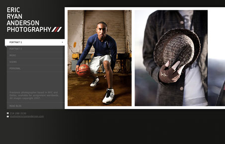
This website was really neat to come across, first of all it’s designed really well. Good typography and nice little details used sparingly for good effect. The coolest thing was to discover the horizontal scrolling and have it actually work for the site visually. Oh yeah, and good photography too. This guy is good.


Well, very nice photography!
Really, I am going to ask this guy to be in my wedding.
Overall design is lovely, nothing too much, although kind of boring. I would have chosen smth else than just gray…
Maybe orange 😛
Good work!
The photography on this site is fantastic, but I can’t stand horizontal designs. My cursor rests at the right side of my monitor, unless I’m doing something specifically different, like clicking on an area or working in a program that isn’t my browser or Word. So I’m always jolted when I realize I have to scroll left to right. It also hurts my eyes a little.
If this were a vertical design, I’d love it a lot.