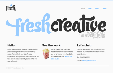
There’s not much to this website, but the design is fresh. I like the color choices and the typeface choice is unique.
There’s not much to this website, but the design is fresh. I like the color choices and the typeface choice is unique.


Glassmorphism brings transparency, depth, and light back into modern UI. Learn how this “frosted glass” design trend enhances hierarchy, focus, and atmosphere, plus how to implement it in CSS responsibly.

Brutalism in web design rejects perfection for authenticity. Stark grids, raw type, and honest structure create interfaces that feel human, intentional, and impossible to ignore. Break the rules, on purpose.

Monochrome Minimalism merges Bauhaus discipline with IKEA simplicity. Clean grids, muted tones, and functional beauty create digital calm, proof that restraint, not decoration, defines timeless design.
The typeface is excellent. I love it.
Does anyone know which type is it?
the fact that there isn’t much to this site is the best part about it, so may designers feel the need to ‘fill’ there sites up with stuff, this site is a perfect example of the right way to advertise yourself, the homepage even looks like a big banner you’d see on a the side of a bus…
10/10 Finch !
i really don’t like the site at all. the guy totally ripped off finch papers which i believe is a registered trademark. the font is cool but really pretentious. the guy probably submitted the site himself to get attention.
The type is called Candy, available at veer.com
Thank you Erik.