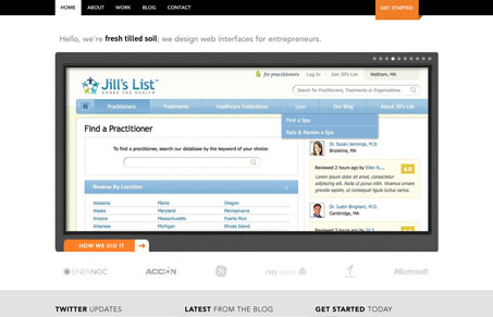
I like the overall organization to this website, both the look & feel and content organization. I like the stark nature to the look, the white background and black and grays with the orange call to action color works cleanly and also gives it a high-end studio feel. I like the content in that the site is deep and rich but not over the top. The project descriptions are great to dig deeper into this firm’s capabilities and are presented in a very clean and clear manner. I like how the blog is put together too, by sorting based on text, video and image posts right off the bat – very cool idea.
Glassmorphism: The Transparent Design Trend That Refuses to Fade
Glassmorphism brings transparency, depth, and light back into modern UI. Learn how this “frosted glass” design trend enhances hierarchy, focus, and atmosphere, plus how to implement it in CSS responsibly.


0 Comments
Trackbacks/Pingbacks