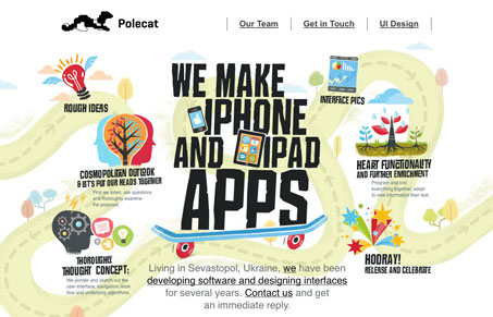
Strong illustrations and bold typography like this always rock! This site is straight up wonderful. Simple execution of the website itself, only complicated up a little with the jquery single page scrolling, but otherwise it’s generally a straight forward site design. Driven home by some top notch quality illustration work, which tells the story of the company perfectly and super quickly. Lovely work!


While this site is nice aesthetically, I think it fails as a Web site. I expected to be able to click in the different icons for more information or click on the illustrations of the team members for more info. But guess what, no linking. I think this is a big missed opportunity. It is just putting up a print brochure if there is not interactivity.
Maybe it would be good to consider substance as well as style.
I kind of took to more along the lines of one of those infographic designs. Not so much as expecting interactivity on all the illustrations as much because they explain out the process your project will go through with them. I can see how it could be seen that way though.
Whilst i love the graphic elements and the imagery used on the site , i cant help but feel it isnt very functional and the layout of the content on the site isnt done in a way that would make me want to stay on it for very long