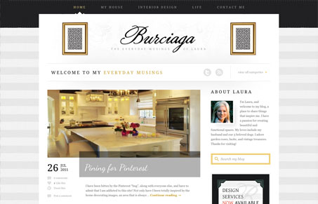
Very nice upscale looking design for this blog. I like how it really sells visually the tone of what this person does. She’s an interior designer, you just get that immediately from the visual design alone. It’s a decent blog content wise too if you’re into this stuff.
Brutalism: The Beauty of Breaking the Rules
Brutalism in web design rejects perfection for authenticity. Stark grids, raw type, and honest structure create interfaces that feel human, intentional, and impossible to ignore. Break the rules, on purpose.


The script font on the blog posts is a perfect choice for this site. It provides a good contrast to the very structured nature of the blog and blog posts.
I do feel that the framed designs in the header are distracting, perhaps they have some special meaning but I just don’t see why they’re there. It would also be nice to have some sort of different editorial design for each type of post (House/Interior Design/Life). The site has so much content it would help to separate these areas visually.
I know what you mean, I thought those framed images were QR codes at first.