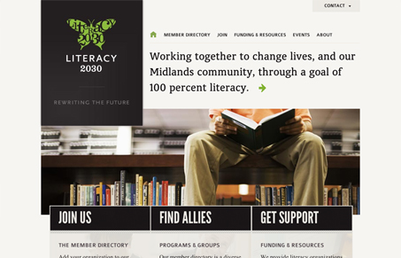
The home page on this site is really striking. Type, color, and imagery are bold and attracting and the layout does a nice job leading you through. I like the simplicity of the three calls to action. They’re succinct, but still provide necessary info. At first I didn’t notice they had images in the background. I’m not sure they’re really needed. I think the only slightly disappointing thing is that the impact of imagery from the home page isn’t carried through a bit more on the internal pages. It does however give a feeling of the cover and pages of a book. Whether or not that was intentional, for me, it’s a nice subconscious tie in.


Glassmorphism: The Transparent Design Trend That Refuses to Fade
Glassmorphism brings transparency, depth, and light back into modern UI. Learn how this “frosted glass” design trend enhances hierarchy, focus, and atmosphere, plus how to implement it in CSS responsibly.


0 Comments