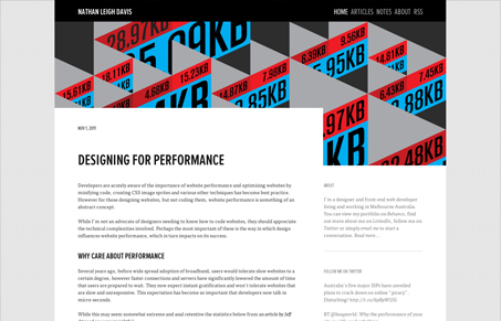
I really love the simplicity of this site. It’s just a really well designed blog with almost perfect typography. The selection of FF Tisa and Proxima Nova Condensed from Typekit is a good choice. I do think the body text size could be slightly larger, this would make it slightly easier to read. As it is, it seems a bit dense. But, overall, this is a good example of how well chosen type with large evocative editorial background image is all you need.
Brutalism: The Beauty of Breaking the Rules
Brutalism in web design rejects perfection for authenticity. Stark grids, raw type, and honest structure create interfaces that feel human, intentional, and impossible to ignore. Break the rules, on purpose.


0 Comments