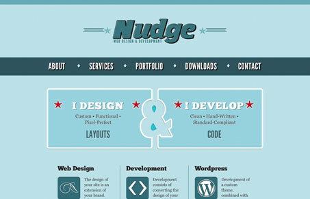
I like the vibe of this website. The colors aren’t typical and it just stands out. I love the design of the “services display” area in the middle of the home page, using the ampersand and negative space like that is pretty clever. I like the overly large bold feel of the design elements too, it’s not exactly optimized for the iPhone but the layout really works well in both mobile and desktop browsers, that is the experience is the same but it just looks really nice on both. Great looking site!


0 Comments