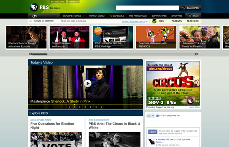
This is the new layout for the PBS.org website, there are a lot of design details that really work here. There are also some that don’t work so well for me, like the big sliding image gallery near the header. It’s confusing as to the context of the images and you don’t know what type of story you’re about to get, video or text only, it’s a surprise. Overall the design is clean and orderly and has the trappings of all major network/news websites. It shines in some areas, like the home page layout of stories down the page, I like the way it’s displayed here. The large drop downs are also nicely used as well.
Brutalism: The Beauty of Breaking the Rules
Brutalism in web design rejects perfection for authenticity. Stark grids, raw type, and honest structure create interfaces that feel human, intentional, and impossible to ignore. Break the rules, on purpose.


0 Comments