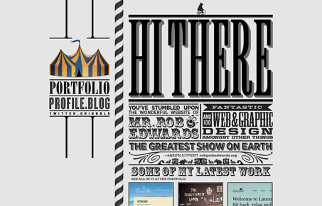
This design reminds me of those turn of the century posters where they used as many display fonts as possible. I love it, it’s also a pretty darn cool example of executing that design style with web fonts. It doesn’t all look like live fonts but the idea is there for sure. I really love how the images in the fixed sidebar change as you scroll too. Great stuff!


0 Comments