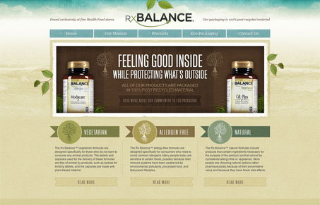
I really dig the RxBalance website. I like the background image/colors used, the watercolor(ish) style is nice. The overall layout is well balanced with copy and imagery. This is probably a super tiny detail but I love how the social media icons look like they are just hovering over the design, it makes them stand out so clearly even though they are down in the footer. Nice work on this site!
Brutalism: The Beauty of Breaking the Rules
Brutalism in web design rejects perfection for authenticity. Stark grids, raw type, and honest structure create interfaces that feel human, intentional, and impossible to ignore. Break the rules, on purpose.


0 Comments