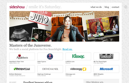
This is a nice tight design. The subtle background tiling is a very nice touch. I particularly like the way they feature the main image from their work front and center like that.
This is a nice tight design. The subtle background tiling is a very nice touch. I particularly like the way they feature the main image from their work front and center like that.


Glassmorphism brings transparency, depth, and light back into modern UI. Learn how this “frosted glass” design trend enhances hierarchy, focus, and atmosphere, plus how to implement it in CSS responsibly.

Brutalism in web design rejects perfection for authenticity. Stark grids, raw type, and honest structure create interfaces that feel human, intentional, and impossible to ignore. Break the rules, on purpose.

Monochrome Minimalism merges Bauhaus discipline with IKEA simplicity. Clean grids, muted tones, and functional beauty create digital calm, proof that restraint, not decoration, defines timeless design.
I like the Web2.0 style of this one – but I don’t really catch the general idea of the communication here: “Smile its Saturday” but maybe its just me..
Anyway its simple and clear in layout and design. I give it 7 stars…