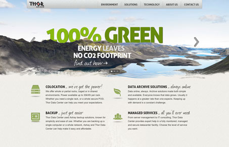
Largely a simple layout the thordc.com site changes up the common slideshow design to make it interesting. I like how the image stays stationary but the words slide behind the mountain peaks, that’s clever. Once you learn the company is in Iceland the name and the imagery makes total sense. Love it. Then the icons down the page next to the main copy help break up the service/product offerings quite well in a digestible format.


0 Comments