
In many ways Threadless.com is very similar to unmatchedstyle, they are both galleries one kind or another, the major difference is Threadless is an e-commerce website. Looking through Threadless with some eye on the details reveals that the managers of this site are doing a superb job of guiding users through the browsing process and integrating some rather rich community based functionality at the same time (more on that later). Largely for the purposes of this post I want to focus on the buying/browsing aspect of the website design, where it really nails it and where in some corners falls short. Like most large scale websites/web apps I get the strong sense that the Threadless site is a living breathing creation that changes with the needs of it’s customers, so what works today may not work tomorrow. That said, there are several parts of this website that are inspiring to me.
The Home Page

1. Boldly Featured Products
There’s probably nothing stronger that can be shown on the home page other than Threadless shirt designs. I love how they do these in “editions”. Since the designs are timely – as in they can run out and you can miss out – it’s clever to show them off that way. Also it’s got to be great to help sales. Gotta get that cool shirt while it’s hot, sort of thing.
2. Toolset
Very clever placement of all the “tools”, the cart, login, join up & search box are all within the same small area in the top left corner. Together they make a nice noticeable area on the page and are also kind of up and out of the way.
3. The Sidebar is a Bear
While I love the Threadless site design a great deal, that sidebar is just out of control. Some editing is in order I think. As a visitor i’m not sure what to click and/or what’s appropriate for me personally. I also get a serious case of banner blindness after the first one or two “badges” I come across on that sidebar.
4. Main Navigation
The main navigation design is very elegant. The drop down elements are subtle and really feel like part of the page when you use them. Also the main nav and the secondary level of content is listed in the footer area, that’s pretty smart for SEO as well as the rest of us humans who make it down to the bottom of the page and can see the full scope of the website there.
The Main Gallery Page
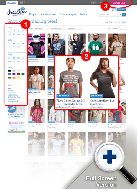
1. Product Sorting Criteria & Tools
The arrangement of these sorting tools is pretty much dead on. You can slice and sort the products list in any way you desire with this toolset and at the same time it’s not overwhelming. It’s almost fun because of the way they look visually too. The element’s aren’t simply boring form elements, the whole little section has been designed to be uniform and to have a nice fun feel.
2. Product Images & Links
The pictures are well done, they also always alternate between a boy and girl across the listing of products. The titles are made up of the words on the shirts or are clever descriptions of the shirt graphics, that works really well for this website I think. I also like the little blue box that helps to put context on availability or price.
3. Join Button
Thinking about that top right corner again, the Join button really stands out up there. It’s a color that is not present anywhere else on the page and the shape is just about right enough to be really noticeable.
Empty Cart
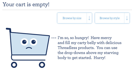
It’s at this point I started to notice the empty cart imagery, if you click on it and have not put anything in your cart yet, you get a really sad looking shopping car that says to you “I’m so hungry, have mercy and fill my belly with T-shirts”. Aarron Walter often talks in-depth about “emotional design”, if you haven’t yet discovered this concept, go take a look at the Mailchimp product and see how they (Aarron is the lead designer there) have integrated emotion and namely fun into their product’s interface. This empty cart illustration is perfect for setting a nice friendly tone on the Threadless website. I love this kind of stuff!
The Product Detail Page
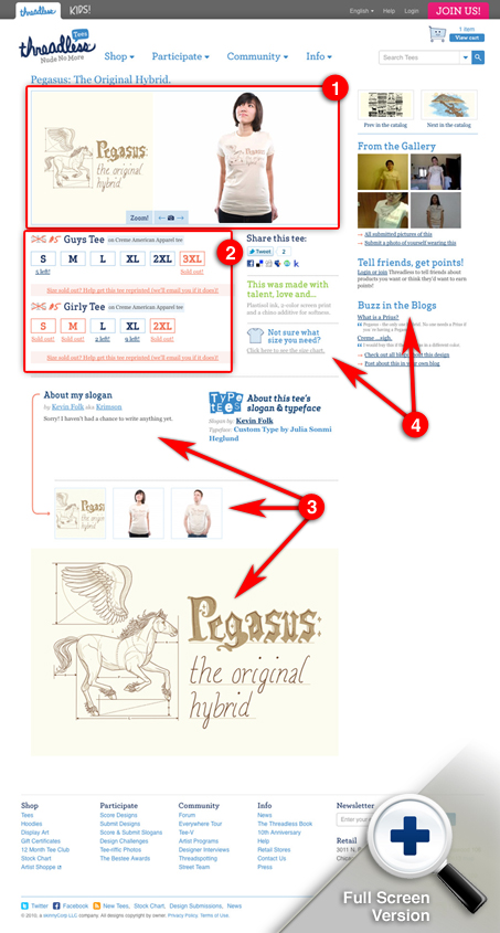
1. Main Product Imagery
Right off the bat here the main product image area design is very well done. You get a nice blow up of the shirt graphic then a series of pictures of models wearing the shirt. There are some simple controls like zoom and back and next for further images/views if you still need more info to make a decision on getting the shirt.
2. Product Selection Criteria & Tools
These product details/sizing items are much like the ones on the main gallery page and like those they are stylized and also highly useful. They are easily scannable, you can tell what’s available very quickly without really reading.
3. About The Artist
This about the artist or “about my slogan” area is brilliant. It’s bringing in a level of connection between me and the artist that really helps convince me of the sale if i’m on the fence. It also allows me to really get behind specific artists if I like the shirt design’s style. Bringing more humanization into the e-commerce is just plain smart…
4. Useful But Jumbled
There are sections like this around the site, where there’s just so much going on with the company and website the design just can’t hold it all in. The things in this small(ish) area are important, but generally secondary to the main gallery & product detail content on the page. As it is now, they come off just a bit jumbled and confusing to me right now.
The Sign Up Page “Join”
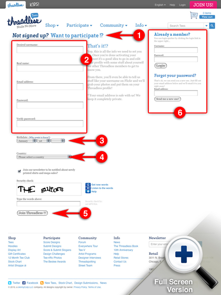
1. Form/Page Title
I love the page title on the sign up page here. It’s prompting you to sign up as well as informing you. Really good microcopy IMHO.
2. Form Elements
The form elements are really very simply executed. I love that they still look like text inputs, it’s hard to leave them alone design wise but I just think the form elements should largely be left to render on their own by the browser and not be overly styled.
3. Birthdate?
The birthdate drop downs are interesting here. I understand why it’s needed, legally. But I think they could really put a little more effort into explaining it. The page will link you off to here as an explanation but that’s just ridiculous and no one is going to read it. Now I don’t have a suggestion as to how to make it more acceptable, but someone like Threadless seems like they could make it humorous in some way… ?
4. Country
I understand this one too, but does it really need to be on the sign up form? Couldn’t this be requested at the time of check out. Unless there’s something that treats you differently once you’ve logged into the site as a member I don’t see how it can be justified. But I’ve been wrong before, if anyone has any ideas let me hear it.
5. Submit
Love the submit button copy! It’s active and actually tells me what’s about to happen upon submission.
6. Log in
Having this on the page is nice placement, the visitor may remember they already have an account and it’s right there.
There is a lot more to the Threadless.com website, I encourage you to spend time on the site studying the design, sign up for an account and check out the member’s only pages. It’s really superb design, but it’s not flashy at the same time. Simple, clean and engaging design for a really strong brand such as Threadless goes a long way.


wow. that breakdown was excellent. Well done.
Thanks Isaac!
Nice in-depth case study. Much appreciated.