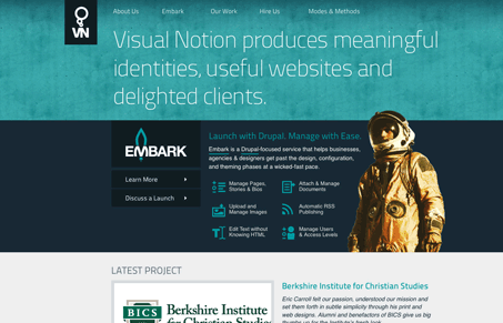
Love these colors, and the icons across the site are nice. The home page is very scannable and easily readable. The content is organized clearly as well. I really like the image of the astronot but I can’t place the context on why it’s there from the content on the page, I get the “embark” and the logo but it might be too vague for your average visitor to get. Overall though, I like the explanation of that section as to what you’re going to get from the service. Good explanative copy will always win for you!
Brutalism: The Beauty of Breaking the Rules
Brutalism in web design rejects perfection for authenticity. Stark grids, raw type, and honest structure create interfaces that feel human, intentional, and impossible to ignore. Break the rules, on purpose.


0 Comments