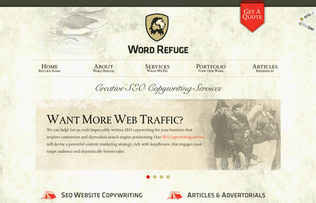
Love the two column layout on the home page. The tone of the coloring and textures makes this site inviting and classic. The red is a great addition in places that demand your attention. I like the “get a quote” form fly out too, I’ve seen that type of thing before and I always wonder if it helps get more form submissions than a typical form page/layout. Seems like it would.
Brutalism: The Beauty of Breaking the Rules
Brutalism in web design rejects perfection for authenticity. Stark grids, raw type, and honest structure create interfaces that feel human, intentional, and impossible to ignore. Break the rules, on purpose.


0 Comments